Fil’s Photography Blog Fine art Photography, For Photographers Filippo Nenna 7/14/22 Fine art Photography, For Photographers Filippo Nenna 7/14/22 Essential steps for making a fine digital print Read More For Photographers, Session, Session Preparation Filippo Nenna 5/9/22 For Photographers, Session, Session Preparation Filippo Nenna 5/9/22 A new portrait-centric YouTube channel Read More For Photographers Filippo Nenna 4/3/22 For Photographers Filippo Nenna 4/3/22 When to blur the background of a photograph Read More For Photographers, Session Filippo Nenna 1/24/22 For Photographers, Session Filippo Nenna 1/24/22 TFP (Trade for Print) tips for models Read More For Photographers Filippo Nenna 1/19/22 For Photographers Filippo Nenna 1/19/22 How to restore damaged old photographs Read More For Photographers Filippo Nenna 1/4/22 For Photographers Filippo Nenna 1/4/22 Unconscious conformity - the trap of default camera settings Read More For Photographers Filippo Nenna 11/9/21 For Photographers Filippo Nenna 11/9/21 Four questions to ask of a photograph Read More For Photographers Filippo Nenna 7/28/21 For Photographers Filippo Nenna 7/28/21 Workflow for setting up a small business (photography) Read More Fine art Photography, For Photographers Filippo Nenna 6/1/21 Fine art Photography, For Photographers Filippo Nenna 6/1/21 A simple way to cut a mat for a frame (and how to bottom-weight the mat) Read More For Photographers Filippo Nenna 5/3/21 For Photographers Filippo Nenna 5/3/21 How real can a photograph be? Read More For Photographers Filippo Nenna 3/23/21 For Photographers Filippo Nenna 3/23/21 Paterson vs Jobo for developing film Read More For Photographers Filippo Nenna 2/10/21 For Photographers Filippo Nenna 2/10/21 The best photography lessons are not from photographers Read More For Photographers Filippo Nenna 12/2/20 For Photographers Filippo Nenna 12/2/20 Forget the exposure triangle! A simpler way to understand exposure. Read More For Photographers Filippo Nenna 11/24/20 For Photographers Filippo Nenna 11/24/20 What's inside the exposure triangle? Read More For Photographers Filippo Nenna 9/8/20 For Photographers Filippo Nenna 9/8/20 That's not full frame... THIS is full frame! Read More Newer Posts Older Posts
Fine art Photography, For Photographers Filippo Nenna 7/14/22 Fine art Photography, For Photographers Filippo Nenna 7/14/22 Essential steps for making a fine digital print Read More
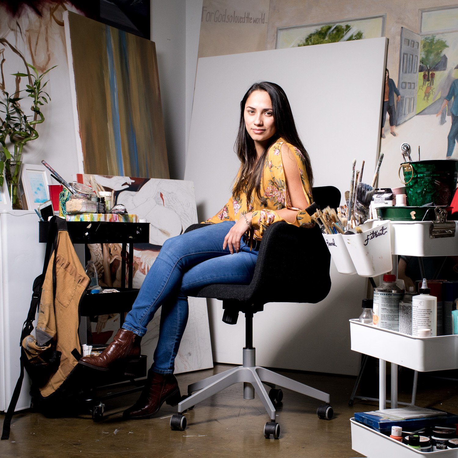
For Photographers, Session, Session Preparation Filippo Nenna 5/9/22 For Photographers, Session, Session Preparation Filippo Nenna 5/9/22 A new portrait-centric YouTube channel Read More
For Photographers Filippo Nenna 4/3/22 For Photographers Filippo Nenna 4/3/22 When to blur the background of a photograph Read More
For Photographers, Session Filippo Nenna 1/24/22 For Photographers, Session Filippo Nenna 1/24/22 TFP (Trade for Print) tips for models Read More
For Photographers Filippo Nenna 1/19/22 For Photographers Filippo Nenna 1/19/22 How to restore damaged old photographs Read More
For Photographers Filippo Nenna 1/4/22 For Photographers Filippo Nenna 1/4/22 Unconscious conformity - the trap of default camera settings Read More
For Photographers Filippo Nenna 11/9/21 For Photographers Filippo Nenna 11/9/21 Four questions to ask of a photograph Read More
For Photographers Filippo Nenna 7/28/21 For Photographers Filippo Nenna 7/28/21 Workflow for setting up a small business (photography) Read More
Fine art Photography, For Photographers Filippo Nenna 6/1/21 Fine art Photography, For Photographers Filippo Nenna 6/1/21 A simple way to cut a mat for a frame (and how to bottom-weight the mat) Read More
For Photographers Filippo Nenna 5/3/21 For Photographers Filippo Nenna 5/3/21 How real can a photograph be? Read More
For Photographers Filippo Nenna 3/23/21 For Photographers Filippo Nenna 3/23/21 Paterson vs Jobo for developing film Read More
For Photographers Filippo Nenna 2/10/21 For Photographers Filippo Nenna 2/10/21 The best photography lessons are not from photographers Read More
For Photographers Filippo Nenna 12/2/20 For Photographers Filippo Nenna 12/2/20 Forget the exposure triangle! A simpler way to understand exposure. Read More
For Photographers Filippo Nenna 11/24/20 For Photographers Filippo Nenna 11/24/20 What's inside the exposure triangle? Read More
For Photographers Filippo Nenna 9/8/20 For Photographers Filippo Nenna 9/8/20 That's not full frame... THIS is full frame! Read More